React and Next.js Example
This tutorial will teach you how to build a basic Next.js project that can submit a proof to the zkVerify network from the browser. We will build a simple application where we will connect to a Substrate-compatible browser extension wallet, and submit two different proofs (Fflonk and Boojum).
TLDR; if you'd like to jump right into the code, the completed project is available in this GitHub Repository
Prerequisites
This tutorial assumes you have already followed the Connect a Wallet tutorial. By now you should have a proper wallet installed, and are able to connect to the zkVerify testnet.
If you are still waiting for testnet tokens, you will still be able to complete this tutorial, with the exception of submitting proofs.
It also assumes basic knowledge of how to get started with a modern web project, including having Node.js v18.17.0 or later, and a code editor of choice.
Initial Setup
Initialize Your Project
Initialize a new Next.js project. This project uses Next.js version 14. Move into your workspace directory and execute the following command:
npx create-next-app@latest
Give your project a name (we will use zk-verify-nextjs-example). Continue to press Enter through the prompts, to accept the default settings, including ESLint, Tailwind CSS, Typescript, etc.
Installing Dependencies
Now that our project is initialized, let's move into the project directory, and install a few more necessary dependencies:
cd zk-verify-nextjs-example
Paste the following into the dependencies object inside the package.json file:
"@nextui-org/react": "^2.3.4",
"@polkadot/api": "^11.2.1",
"@polkadot/extension-dapp": "^0.47.5",
"@polkadot/extension-inject": "^0.47.5",
"framer-motion": "^11.1.5",
This will allow us to leverage the Polkadot.js utilities for interacting with zkVerify, and also NextUI for some nice UI components, built on Tailwind CSS.
To install the latest dependencies, run:
npm install
By now we should have our basic project setup. Let's confirm our app is running correctly by running it in dev mode:
npm run dev
Navigate to http://localhost:3000 to see the boilerplate application.
Removing Boilerplate Code
Let's remove some unnecessary boilerplate code:
Update the src/app/page.tsx to the following:
// src/app/page.tsx

export default function Home() {
  return <div>Home Page</div>;
}
Secondly, update the src/app/globals.css to the following:
/* src/app/globals.css */

@tailwind base;
@tailwind components;
@tailwind utilities;
Setting Up NextUI
We'll want to leverage NextUI for our UI components, such as Buttons, Tabs, Links, etc.
First, we'll need to modify our tailwind.config.ts to the following:
// tailwind.config.ts

import { nextui } from "@nextui-org/react";
import type { Config } from "tailwindcss";

const config: Config = {
  content: [
    "./src/pages/**/*.{js,ts,jsx,tsx,mdx}",
    "./src/components/**/*.{js,ts,jsx,tsx,mdx}",
    "./src/app/**/*.{js,ts,jsx,tsx,mdx}",
    "./node_modules/@nextui-org/theme/dist/**/*.{js,ts,jsx,tsx}",
  ],
  theme: {
    extend: {
      backgroundImage: {
        "gradient-radial": "radial-gradient(var(--tw-gradient-stops))",
        "gradient-conic":
          "conic-gradient(from 180deg at 50% 50%, var(--tw-gradient-stops))",
      },
    },
  },
  darkMode: "class",
  plugins: [nextui()],
};
export default config;
Adding the NextUI Provider
Create a src/providers/index.tsx file and paste the following:
// src/providers/index.tsx

"use client";

import { NextUIProvider } from "@nextui-org/react";

export function Providers({ children }: { children: React.ReactNode }) {
  return <NextUIProvider>{children}</NextUIProvider>;
}
Next, update the src/app/layout.tsx by pasting the following:
// src/app/layout.tsx

import type { Metadata } from "next";
import { Inter } from "next/font/google";
import "./globals.css";
import { Providers } from "@/providers";

const inter = Inter({ subsets: ["latin"] });

export const metadata: Metadata = {
  title: "Create Next App",
  description: "Generated by create next app",
};

export default function RootLayout({
  children,
}: Readonly<{
  children: React.ReactNode;
}>) {
  return (
    <html lang="en">
      <body className={inter.className}>
        <Providers>{children}</Providers>
      </body>
    </html>
  );
}
At this point, our app is ready to use NextUI components.
Connecting to zkVerify
Now, we'll set up our connection to the zkVerify testnet.
Setting Up a Constants File
First, let's create a src/constants.ts file and paste the following:
// src/constants.ts

export const MOCK_FFLONK_PROOF =
  "0x283e3f25323d02dabdb94a897dc2697a3b930d8781381ec574af89a201a91d5a2c2808c59f5c736ff728eedfea58effc2443722e78b2eb4e6759a278e9246d600f9c56dc88e043ce0b90c402e96b1f4b1a246f4d0d69a4c340bc910e1f2fd80519e465e01bd7629f175931feed102cb6459a1be7b08018b93c142e961d0352d80b8e5d340df28c2f454c5a2535ca01a230bb945ee24b1171481a9a2c6496fed61cf8878e40adb52dc27da5e79718f118467319d15d64fed460d69d951376ac631a6c44faaec76e296b43fe720d700a63fd530f9064878b5f72f2ffe7458c2f031ac6ed8c1e0758dfb3702ed29bbc0c14b5e727c164b3ade07b9f164af0be54b0143b1a6534b2dcf2bd660e1b5b420d86c0c350fd9d614b639c5df98009f1375e141259679021d0a6a3aa3aae2516bace4a4a651265217ec0ea7c0d7f89b987100abcc93d98ff40bae16eff6c29955f7a37155bb25672b12eb5074dcb7c3e2b001718a257cca21ee593d1ba9f8e91e5168aed8e0b1893e11a6b583d975e747f8008a8c2150a04d8f867945ca1740dc3fc3b2fc4daff61b4725fb294435a1b90101803690ae70fc212b7e929de9a22a4642ef4772546cf93ffd1b1196a3d9113a3009c506755578932ca3630508ca1ed6ee83df5ec9e26cb0b5800a70967a1a93a04d142b6a532935a31d84f75d16929df6d38c3a210ac4f435a8024dfb7e6c1f3246d58038a943f237325b44f03d106e523adfec4324615a2dd09e1e5b9143b411c1cf09ee411cf9864d30df4904099920cee9ae8134d45dfeb29e46115d2e740098674b8fc2ca31fac6fcc9302860654fdc1b522b7e064b0759bc5924f332fa921121b5af880f83fbce02f19dabb8f684593e7322fb80bfc0d054797b1d4eff411b01bf68f81f2032ae4f7fc514bd76ca1b264f3989a92e6b3d74cda4f8a714920e4c02f5a71082a8bcf5be0b5750a244bd040a776ec541dfc2c8ae73180e9240ada5414d66387211eec80d7d9d48498efa1e646d64bb1bf8775b3796a9fd0bf0fdf8244018ce57b018c093e2f75ed77d8dbdb1a7b60a2da671de2efe5f6b9d70d69b94acdfaca5bacc248a60b35b925a2374644ce0c1205db68228c8921d9d9";

export const MOCK_BOOJUM_PROOF =
  "0x02c6cf2fd56edca1f17f406cceef3de1c99bba6e499ed96ef4f453af011257c420944a838b2cd133a414ae6882fd8cc0dfb7daa14540d796ab937f65479beaca1fb7b349b2a6dc4edfc8191e31ddc0b342840dc575ad213473529611e15261e8020c09be65a4d571cadbb39b0737777c365af77b4702d6e1a4e0340abb1cb8c3221cc01cc33c432ab679319c724544616069b0d6f4df5f537ec36887deead9631fc36d5da22c35d8d83eb74ccc2afa4a83d2d6c604998ac86e653f1307d016200e01dd9bbcfa860fe26eca3f159b473fa073fce20ef5354c25d52e5e9c4bc2930b5ae2e3e19c47907074ef77fc0e113920e9f702ad0f7f1789c696a47849ebcb21db13fcf4fc3cc99f9879514cb5a3ac5b672a4343b915833be0cb9c4281e1810a376c40d30b54d2c82d98e26d93f4d2fa5010ef0973f4c9ddc5eb83074b2fdf011214912fffecc3507d741e4164d049963f4e22dfefc659a2d4122e141f8f8700cf13591e41e00c27c19f05546c874287a483df746fd1c5f66b955f5caf1fc00928a89a4c924f98bd2bb78a704a7879f15799dcf7e94d2f465c33b65358519606f57ff3f11aee64bdffac49821dda7e029a281519e0f6a44302bd822d69e08d1797df980a6a223e0b455ad79df6ee836ac09486e3c4ce28ee870249e5d1db8f1bf81479df3717fee0f378da47910f1177685a7de078eb5dc2ae65d1ff321cdf2b3c88144fd8079426e8c39efb62913aac7cf198d6a557c9c55f448d65d8aa492a54cd2ae2e57b5ce3918aa3a75f827e8511fa6196d83e0fa77f45e789fa73cd2773b310f717b8af7bfc3456f6e008f9f8c2286808e4430d8d1b0260a5a0f08616887cc329cd4754a0994979552a26b055541d89419c083bb4bb5de0939716b6235a83962376096cac86e2f3497e16083fc0f126305a5b5d822f79b65411e6a0250b0c229cb9efa1d8f7b64754f21fc2d81d8c122d8cc57eafc2b4b2d2b02b262b65157804674d8d5da0a9c18d1d1f48c75ac8a8196bd52cb789b0b2947dbf63258d968097930fc5abd8e36b9aa1b28c8038a1f87292212ca2c0a55673e2a0480f380acabf71e994271a65230015428d1fb0fa29944c4215f070ccfe537dfe37065db5ba5c90ae76cab0e69e2a5f61d238d52b936769a3f7ed6bd98bafe4d15c17548ede6302f4d806e3217b0035927359463fdaf1ca86c439db078959f3f6aa2de55a8662d700be14b546e2099289b221f7bdf8e8d078547d9996f82f13f9e529e3c758071eab1259735092d4fac514b9bd3b87242350a0497e537ef96ac4241265632779c8a98844dea0cb1496e49fb2ab2f50d9533050c840fd2c9155d4e807a69fdafeca7e7aabdfbe234170d106eb0bc2b6e3a3d0c27fcbb8ec611aa7861d57b0926ca97b7137aceeae7c061cdb619a893fce4a77187948db00828b51e70cfbdb9f6b06aaea8b037452a37aa113c75f8a0d8755f69de8e9dbdaff5dc9742b3723cee611e17f0b5f45389e3794d499698df78583610371d6fb780ab8fb080085c1e5e3312cd0cfdf1c440ce0778f84e49f9ebe6217025d6e0a3caa019dc713390dd68b9d7e2971c85dcef20f0fd39e653d03a15d43920502ab4aaea724d4283bffa5d557519aface6622844659eb8704aba1eb7d1440e9838e5ca42aaf4824ed9174f5cae88f196a15a07fabca68c0a76cb22749d5b96a3f30eba226061d1fc0ccaf6d01858bc5096ce8c231e78e52df028888ce52d1803edd0924c08cde09ec0d1241c98d7bedb141e8abe63b5645fd6bf3b143c42004f91a4d4a4cd2480d333ed34a878fcdde8e16b6ebe9c70237f1d856c0e37e4d9aec479cdb4c8e9316284c2edd3202941fdedd81a6ee4fa6735cac981f8cc1a5609a27bb774b5901281497fb2be671c9dac31aad3c122f3859a9f838f8543c7fc2bab27e84dc4b6a2343c5416c38c8dcbbb56f1e3ccf31644ab66ebe86e77cec68836d3771d7e3a800000000a45a2ec20c3f34f4c69cea200fdf39cc78ff50092f7cb1e2894f4d35";

export const WSS_URL = "wss://testnet-rpc.zkverify.io";

export const BLOCK_EXPLORER_BASE_URL = "https://testnet-explorer.zkverify.io";
This file contains the proofs we'll use for verification, along with URL's required for connecting to the zkVerify testnet and block explorer.
Creating a ZKV Provider
We'll wrap out application with another provider, which we will call the ZKVProvider. Let's create a src/providers/zkv-provider.tsx and paste the following code:
// src/providers/zkv-provider.tsx

"use client";

import { WSS_URL } from "@/constants";
import { ApiPromise, WsProvider } from "@polkadot/api";
import { web3Accounts, web3Enable } from "@polkadot/extension-dapp";
import { InjectedAccountWithMeta } from "@polkadot/extension-inject/types";
import {
  createContext,
  useCallback,
  useContext,
  useEffect,
  useState,
} from "react";

type ZKVProviderState = {
  connectedAccount?: InjectedAccountWithMeta;
  api?: ApiPromise;
  handleConnectWallet: () => Promise<void>;
  handleDisconnectWallet: () => void;
};

const ZKVContext = createContext<ZKVProviderState>({
  handleConnectWallet: () => Promise.resolve(),
  handleDisconnectWallet: () => {},
});

export function useZKV() {
  return useContext(ZKVContext);
}

export default function ZKVProvider({
  children,
}: {
  children: React.ReactNode;
}) {
  const [api, setApi] = useState<ApiPromise>();
  const [connectedAccount, setConnectedAccount] =
    useState<InjectedAccountWithMeta>();

  const setup = useCallback(async () => {
    const wsProvider = new WsProvider(WSS_URL);
    const api = await ApiPromise.create({ provider: wsProvider });
    setApi(api);
  }, []);

  useEffect(() => {
    setup();
  }, [setup]);

  const handleConnectWallet = useCallback(async () => {
    const extensions = await web3Enable("zk-verify-nextjs-example");

    if (!extensions) {
      throw new Error("No extension found");
    }

    const allAccounts = await web3Accounts();

    // For now, select first available account
    // More robust apps would allow selecting which account to connect
    setConnectedAccount(allAccounts[0]);
  }, []);

  const handleDisconnectWallet = useCallback(async () => {
    setConnectedAccount(undefined);
  }, []);

  return (
    <ZKVContext.Provider
      value={{
        api,
        connectedAccount,
        handleConnectWallet,
        handleDisconnectWallet,
      }}
    >
      {children}
    </ZKVContext.Provider>
  );
}
This will allow us to connect to a wallet, create an websocket connection to zkVerify, and share a handful of useful information globally across our app, including the api instance, our connected wallet address, etc.
Let's add this provider by updating our src/providers/index.tsx to the following:
// src/providers/index.tsx

"use client";

import { NextUIProvider } from "@nextui-org/react";
import dynamic from "next/dynamic";

const ZKVProvider = dynamic(() => import("@/providers/zkv-provider"), {
  ssr: false,
});

export function Providers({ children }: { children: React.ReactNode }) {
  return (
    <NextUIProvider>
      <ZKVProvider>{children}</ZKVProvider>
    </NextUIProvider>
  );
}
Keep in mind, we leverage next/dynamic to prevent pre-rendering issues, as the ZKVProvider makes references to window behind the scenes.
Now our application is creating an api instance on initial load. We can use it to interact with the zkVerify testnet by querying the network, or making extrinsic calls.
Building the UI
Now, we can start constructing a basic UI. Let's start with a navbar and a connect wallet button.
The Connect Wallet Button
Let's start off by creating a src/components/connect-wallet-button.tsx file and paste in the following code:
// src/components/connect-wallet-button.tsx

"use client";

import { useZKV } from "@/providers/zkv-provider";
import {
  Button,
  Dropdown,
  DropdownItem,
  DropdownMenu,
  DropdownTrigger,
} from "@nextui-org/react";

export default function ConnectWalletButton() {
  const { connectedAccount, handleConnectWallet, handleDisconnectWallet } =
    useZKV();
  return (
    <>
      {!connectedAccount && (
        <Button onClick={handleConnectWallet} className="bg-emerald-400">
          Connect Wallet
        </Button>
      )}
      {connectedAccount && (
        <Dropdown>
          <DropdownTrigger>
            <Button variant="bordered">
              {getAbbreviatedHash(connectedAccount.address)}
            </Button>
          </DropdownTrigger>
          <DropdownMenu aria-label="Dropdown actions">
            <DropdownItem
              onClick={handleDisconnectWallet}
              color="danger"
              className="text-danger"
            >
              Disconnect
            </DropdownItem>
          </DropdownMenu>
        </Dropdown>
      )}
    </>
  );
}

function getAbbreviatedHash(hash: string) {
  return `${hash.substring(0, 4)}...${hash.substring(
    hash.length - 4,
    hash.length
  )}`;
}
Notice, this button is able to pull necessary information from our ZKVProvider and render itself differently based on whether or not we have our wallet connected.
The Navbar Component
Next, we'll build a basic Navbar component where our ConnectWalletButton will live. Create a src/components/navbar.tsx file and paste in the following code:
// src/components/navbar.tsx

import Link from "next/link";
import ConnectWalletButton from "./connect-wallet-button";

export default function Navbar() {
  return (
    <div className="flex h-[75px] w-full items-center px-8 bg-gray-50">
      <Link className="text-lg font-bold" href="/">
        zkVerify Next.js Example
      </Link>

      <div className="ml-auto">
        <ConnectWalletButton />
      </div>
    </div>
  );
}
To add our Navbar component, let's be sure to add it to our layout. Update your src/app/layout.tsx file to the following:
// src/app/layout.tsx

import type { Metadata } from "next";
import { Inter } from "next/font/google";
import "./globals.css";
import { Providers } from "@/providers";
import Navbar from "@/components/navbar";

const inter = Inter({ subsets: ["latin"] });

export const metadata: Metadata = {
  title: "Create Next App",
  description: "Generated by create next app",
};

export default function RootLayout({
  children,
}: Readonly<{
  children: React.ReactNode;
}>) {
  return (
    <html lang="en">
      <body className={inter.className}>
        <Providers>
          <Navbar />
          {children}
        </Providers>
      </body>
    </html>
  );
}
Now, our Navbar component will be rendered across any pages in our application.
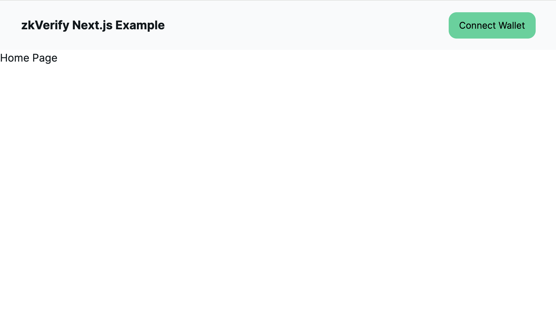
Let's check that our UI is rendering correctly. We should now see our Navbar and be able to connect and disconnect our wallet.
Be sure your development server is up by running npm run dev and head to http://localhost:3000.
You should see the following UI:
The Basic Proof Component
Since we'll be submitting two very similar proofs, let's create a generic component for submitting a proof. Create a src/components/basic-proof.tsx file and paste in the following code:
// src/components/basic-proof.tsx

"use client";

import { BLOCK_EXPLORER_BASE_URL } from "@/constants";
import { useZKV } from "@/providers/zkv-provider";
import { Button, Link, ScrollShadow } from "@nextui-org/react";
import { web3FromAddress } from "@polkadot/extension-dapp";
import { useCallback, useState } from "react";

type Props = {
  mockProof: string;
  proofType: "Fflonk" | "Boojum";
  pallet: "settlementFFlonkPallet" | "settlementZksyncPallet";
};

export default function BasicProof({ mockProof, proofType, pallet }: Props) {
  const { connectedAccount, api } = useZKV();
  const [status, setStatus] = useState<"loading" | "error" | "success" | null>(
    null
  );
  const [errorText, setErrorText] = useState<string | null>(null);
  const [blockHash, setBlockHash] = useState<string | null>(null);

  const submitProof = useCallback(async () => {
    if (!api || !connectedAccount) {
      return;
    }

    const injector = await web3FromAddress(connectedAccount.address);

    // Reset states
    setBlockHash(null);
    setErrorText(null);
    setStatus("loading");

    let unsub: () => void;
    let txSuccessEvent = false;

    try {
      unsub = await api?.tx[pallet].submitProof(mockProof).signAndSend(
        connectedAccount.address,
        {
          signer: injector.signer,
        },
        ({ status, events, dispatchError }) => {
          if (dispatchError) {
            setStatus("error");
            setErrorText(`Something went wrong: ${dispatchError}`);
            unsub();
          }

          // Must see the ExtrinsicSuccess event to be sure the tx is successful
          events.forEach(({ event: { data, method, section }, phase }) => {
            if (section == "system" && method == "ExtrinsicSuccess") {
              txSuccessEvent = true;
            }
          });

          if (status.isFinalized) {
            if (txSuccessEvent) {
              setStatus("success");
              setBlockHash(status.asFinalized.toString());
            } else {
              setStatus("error");
              setErrorText("ExtrinsicSuccess has not been seen");
            }

            unsub();
          }
        }
      );

      return unsub;
    } catch (e: unknown) {
      setStatus("error");
      setErrorText(
        `Something went wrong: ${
          e instanceof Error ? e.message : "Could not submit proof"
        }`
      );
    }
  }, [api, connectedAccount, mockProof, pallet]);

  return (
    <div className="w-full">
      <h1 className="text-large font-bold mb-2">Submit {proofType} Proof</h1>
      <ScrollShadow className="w-[600px] h-[400px] break-all">
        {mockProof}
      </ScrollShadow>

      <Button
        onClick={submitProof}
        type="button"
        className=" bg-emerald-400 mt-3"
        isDisabled={status === "loading" || !connectedAccount}
        isLoading={status === "loading"}
      >
        Submit Proof
      </Button>
      {status === "success" && blockHash && (
        <div className="mt-2">
          Proof Verified! Tx included in block.{" "}
          <Link
            target="_blank"
            href={`${BLOCK_EXPLORER_BASE_URL}/v0/block/${blockHash}`}
          >
            View on Block Explorer
          </Link>
        </div>
      )}
      {status === "error" && errorText && (
        <div className="mt-2 text-red-900">{errorText}</div>
      )}
    </div>
  );
}
This component seems a bit complicated, so let's walk through what it does:
- Defines the necessary types for the component
Props(e.g. fflonk, boojum) - Defines a
submitProoffunction which will send the proof to the network, and listen for updates on the websocket connection. - Render the required UI, including loading and error states.
Rendering the Basic Proof Component
Now, let's add our BasicProof component to our home page, and a set of Tabs to toggle between the different proof types. Update your src/app/page.tsx to the following:
// src/app/page.tsx

"use client";

import { MOCK_BOOJUM_PROOF, MOCK_FFLONK_PROOF } from "@/constants";
import { Tab, Tabs } from "@nextui-org/react";
import dynamic from "next/dynamic";
const BasicProof = dynamic(() => import("@/components/basic-proof"), {
  ssr: false,
});

export default function Home() {
  return (
    <div className="w-[800px] mx-auto py-8">
      <Tabs size="lg" aria-label="Tabs for Proof Types">
        <Tab key="fflonk" title="Fflonk">
          <BasicProof
            mockProof={MOCK_FFLONK_PROOF}
            pallet="settlementFFlonkPallet"
            proofType="Fflonk"
          />
        </Tab>
        <Tab key="boojum" title="Boojum">
          <BasicProof
            mockProof={MOCK_BOOJUM_PROOF}
            pallet="settlementZksyncPallet"
            proofType="Boojum"
          />
        </Tab>
      </Tabs>
    </div>
  );
}
We see our BasicProof component is generic, allowing us to reuse it for both Fflonk and Boojum proofs.
Notice, the use of next/dynamic once again to avoid pre-rendering issues.
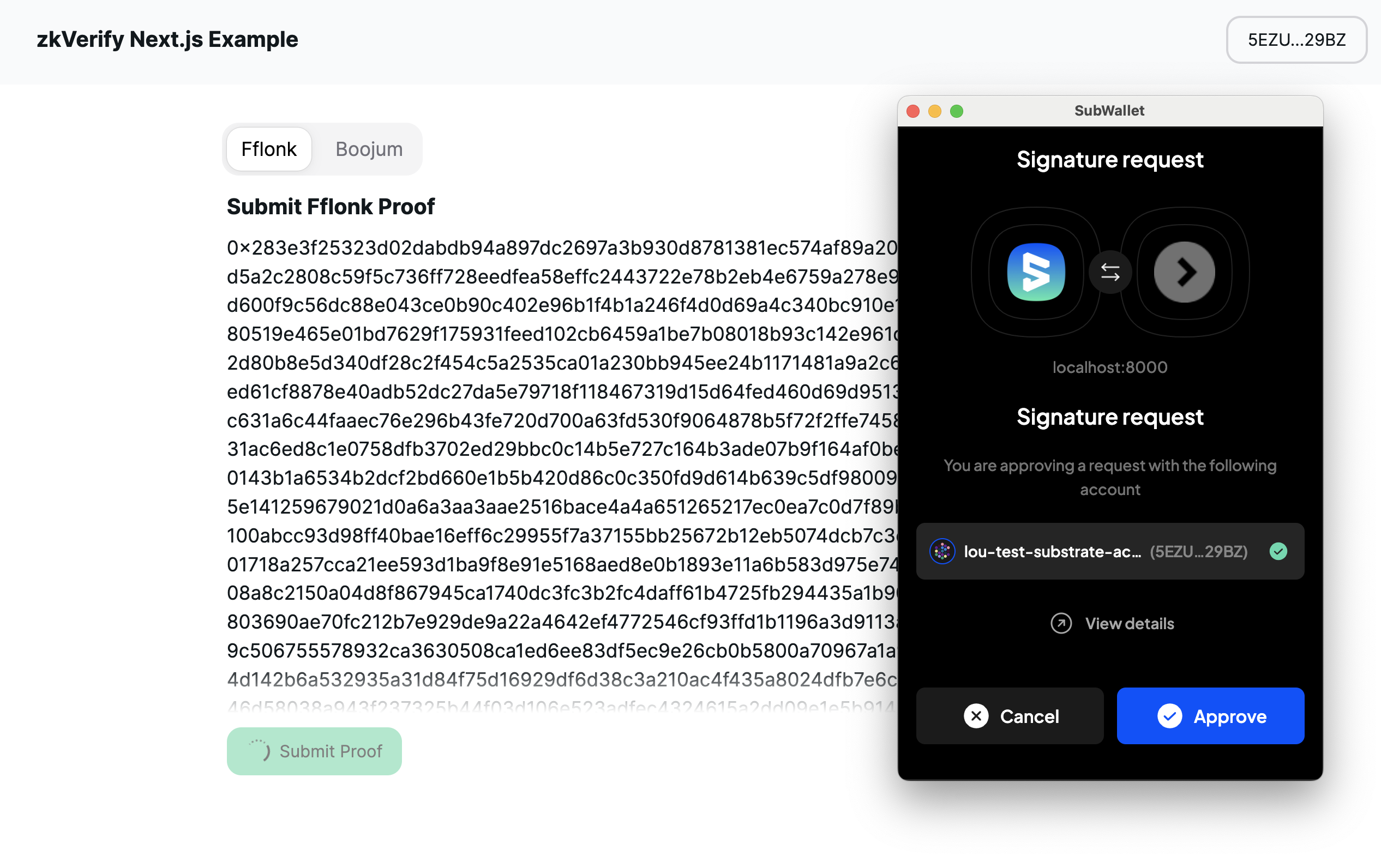
Submitting our Proof
You should now see the ability to submit a proof, once your wallet is connected:
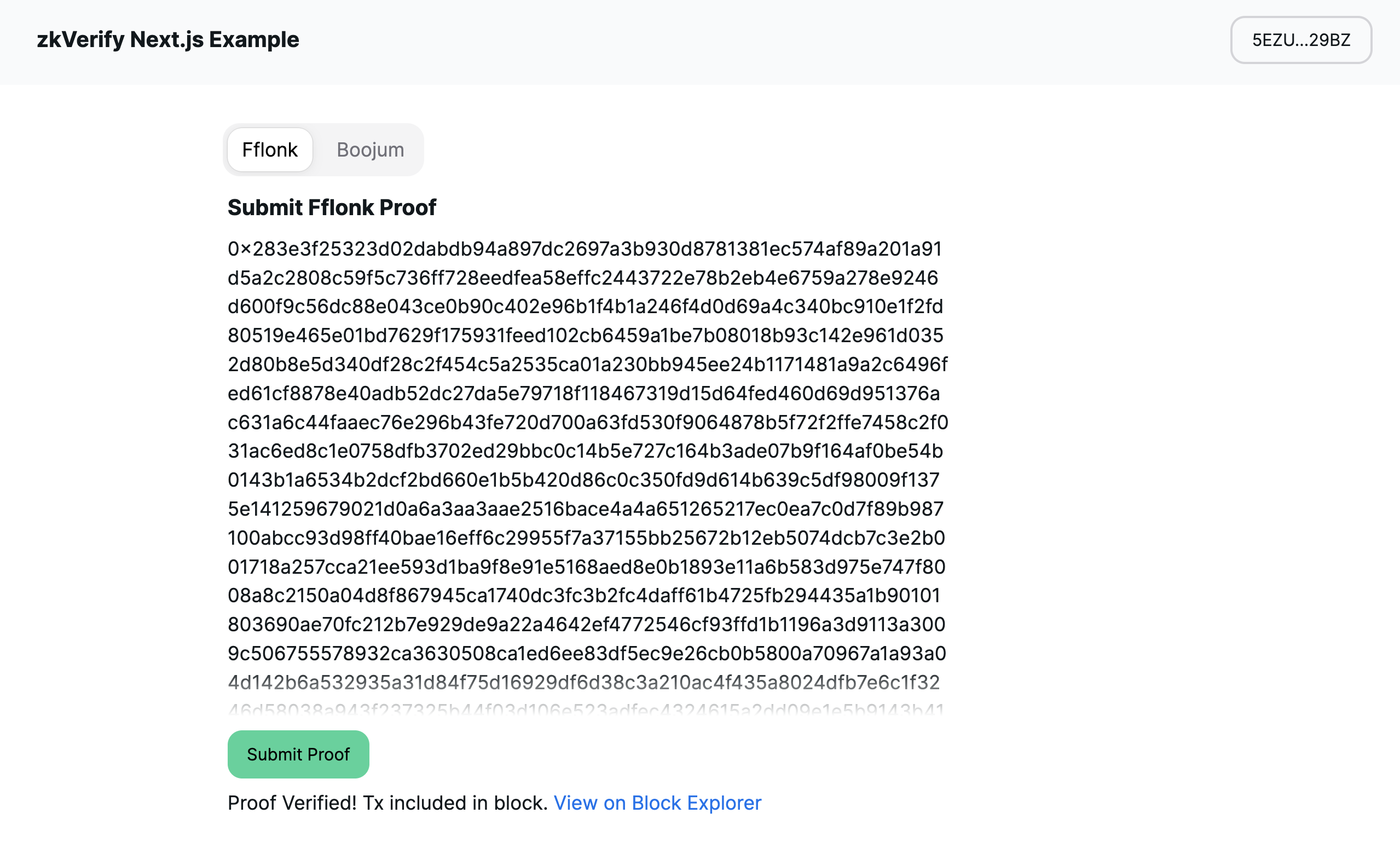
And once the transaction is accepted by the network, you will see a success message, along with a link to the block explorer to confirm.
Wrapping Up
We have now successfully built a Next.js application with the ability to connect a wallet and submit proofs to the zkVerify testnet. If you had any issues along the way, the final code is available here as well.